
The Psychology Behind the Color Pink in Luxury Fashion
Updated: Aug 19
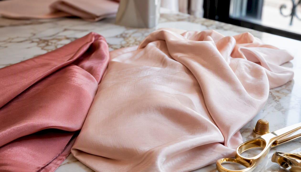
Pink signals warmth, nurturance, approachability, and romantic tenderness — but its psychological effects are never universal. Shade, cultural context, and individual memory all shape how the color lands. Baker-Miller pink, the specific hue used in institutional settings to test calming effects, became the most cited example of color psychology in practice, yet its results are short-lived and inconsistently replicated. Pantone’s recurring elevation of pink-family shades to cultural prominence, from Rose Quartz to Viva Magenta, reflects how deeply the color continues to shape desire and identity in fashion and branding. At Vivien Lauren, pink is treated not as a trend but as a considered emotional language — one that rewards understanding before wearing.
Pink’s emotional effects are shade-dependent: pastel reads as soothing; hot pink reads as defiant energy; deep rose reads as sensual luxury.
Cultural context matters: pink carries different weight in Japan (cherry blossoms, transience) than in the United States (romance, femininity, reclamation).
The calming effect of pink is real but brief — habituation typically neutralizes it within minutes to hours.
Key Takeaways
Pink’s psychological effects are real but always conditional — shade, proportion, cultural context, and individual memory determine whether the color reads as tender, defiant, or luxurious.
Point | Details |
Shade determines meaning | Pastel signals calm; hot pink signals energy; deep rose signals sensual luxury. |
Baker-Miller effect is short-lived | Calming results from pink environments habituate quickly and are inconsistently replicated. |
Gendering of pink is recent | Pink’s feminine association is a 20th-century market construct, not a biological or historical constant. |
Luxury use favors muted shades | Dusty and deep rose tones preserve sophistication; saturated pinks work best as deliberate statements. |
Vivien Lauren applies shade precision | Curated Italian-crafted pieces use dusty rose, warm coral, and deep rose to balance femininity with timeless elegance. |
Table of Contents
The psychology behind the color pink: core meanings and shade-level shifts
What the evidence actually says about pink’s calming effects
How to use pink effectively in branding, interiors, and luxury fashion
Pink, femininity, and the luxury wardrobe — a considered perspective
The Vivienlauren collection and the art of wearing pink well
How pink’s psychological meaning has evolved over centuries
Pink’s story is not a straight line from innocence to femininity. It is a record of shifting power, commerce, and cultural reinvention.
Antiquity and the Renaissance: Rosy pigments appeared in cosmetics and portraiture as markers of health and fertility. A flushed complexion signaled vitality, and painters used rose-tinted flesh tones to convey life and desirability.
18th-century aristocracy: Pastel pinks flourished in the courts of Europe, most famously associated with Madame de Pompadour, whose patronage of the Sèvres porcelain manufactory helped establish soft rose as a color of refinement and privilege.
Synthetic dyes and mass availability: The 19th century’s aniline dye revolution made pink accessible beyond the aristocracy, diluting its exclusivity but widening its cultural reach.
Elsa Schiaparelli’s shocking pink: In 1937, Schiaparelli introduced “Shocking Pink” — a saturated, almost violent fuchsia — as a deliberate provocation. It was the first time pink was weaponized as a statement of creative defiance rather than gentle femininity.
Post-WWII gendering: The mid-20th century saw pink assigned firmly to girls and blue to boys, a historically recent and market-driven shift rather than any innate biological preference. Barbie’s debut in 1959 and the subsequent “Barbie pink” branding cemented this association in consumer culture for decades.
Modern reclamation: Breast Cancer Awareness campaigns, LGBTQ+ activism, and the Barbiecore moment of 2023 each reframed pink as a color of solidarity, irony, and conscious feminism. National Geographic’s scholarship on pink’s history traces this arc from aristocratic luxury through gendered marketing to present-day reclamation movements.
The psychology behind the color pink: core meanings and shade-level shifts
Pink sits at the intersection of red’s passion and white’s purity. As a tint family, it inherits red’s warmth and arousal potential while white’s addition softens that energy into something more approachable. The result is a color that can feel tender or electric depending almost entirely on saturation and value.
In Western psychology, pink’s most consistent associations include tenderness, warmth, innocence, romance, and playfulness. Its negative readings — weakness, infantilization, excessive sweetness — tend to emerge when the shade is too pale, the proportion too dominant, or the context too literal.
Shade-vs-meaning matrix:
Shade | Primary associations | Luxury application |
Pastel / baby pink | Innocence, calm, approachability | Soft accent in interiors; delicate garment details |
Millennial / dusty pink | Modern restraint, gender-neutral sophistication | Premium retail environments; elevated casualwear |
Hot pink / fuchsia | Energy, defiance, youthful confidence | Statement pieces; limited-edition capsules |
Coral / warm rose | Warmth, wearability, flattering near skin | Garments; scarves; accessories |
Deep rose / burgundy | Sensuality, maturity, luxury | Evening wear; leather goods; high-end accessories |
Cultural variation adds another layer. In Japan, pink evokes the transience of cherry blossoms — beauty inseparable from impermanence. In India, pink and rose tones carry festive and spiritual resonance, associated with the lotus and with celebration. Exploring Your Mind’s shade-level analysis confirms that pale pinks read as tender and calm across most Western contexts, while hot pinks carry energy and defiance, and deep roses signal sensuality and luxury.
What each shade of pink actually communicates
Understanding shade differences is the practical core of color psychology pink in fashion and design. Each family carries a distinct emotional signature.
Light and pastel pink: Communicates innocence, gentleness, and approachability. In luxury contexts, it works best as an accent rather than a dominant tone — a blush lining, a soft trim — where it adds warmth without overwhelming the palette’s sophistication.
Millennial / dusty pink: The most versatile shade for premium retail. Its muted, slightly greyed quality reads as modern and gender-neutral, avoiding the sweetness trap while retaining warmth. Widely adopted in premium packaging and boutique interiors precisely because it feels considered rather than obvious.
Hot pink / fuchsia: Schiaparelli’s legacy lives here. This shade carries energy, rebellion, and confident self-expression. In luxury womenswear, it functions best as a deliberate statement — a single bold piece rather than a full look — where its intensity reads as power rather than noise.
Coral and warm rose: Flattering against a wide range of skin tones, these shades carry warmth and wearability. They feel intimate and human, which makes them particularly effective in garments worn close to the face: scarves, blouses, and draped dresses.
Deep rose and burgundy: The most unambiguously luxurious end of the pink spectrum. Their depth signals maturity and sensuality, pairing naturally with gold, charcoal, and rich textures. In leather goods and evening wear, deep rose reads as a sophisticated alternative to classic red.

What the evidence actually says about pink’s calming effects
The most famous claim in color psychology pink is that a specific shade — Baker-Miller pink, also called “drunk-tank pink” — reduces aggression and calms physiological arousal. The origin lies in research conducted in the late 1970s and early 1980s, when correctional facilities painted holding cells in this bubblegum hue and reported short-term reductions in aggressive behavior.
The problem is replication. Controlled studies found no reliable reduction in aggression tied solely to the paint color. Environmental novelty, expectation effects, and the simple fact of a changed setting likely contributed to early results. Psychologies UK’s institutional review notes that many practitioners report the calming effect is short-lived: habituation sets in quickly, and prolonged exposure can provoke irritation or a sense of infantilization rather than calm.
Evidence summary:
Study / source | Design | Key result |
Baker-Miller original research (1970s–80s) | Observational, correctional settings | Short-term behavioral calm reported; no control group |
Replication attempts (various, cited in Wikipedia) | Controlled lab conditions | No reliable aggression reduction from color alone |
Institutional practitioner reports | Field observation | Calming effect present initially; habituates within hours |
Individual differences matter enormously here. Personal memory, cultural background, and even the specific saturation of the pink used all modulate response. A shade that soothes one person may feel cloying or infantilizing to another.
Pro Tip: Use pink strategically and sparingly in environmental design. A single pink accent wall or a rose-toned textile introduces warmth without triggering habituation. Full-room saturation in any pink shade tends to exhaust rather than calm.
How to use pink effectively in branding, interiors, and luxury fashion
Pink’s power in branding lies in what industry color experts describe as “emotional accessibility” — the ability to soften a brand’s intensity while keeping its warmth. Sherwin-Williams and Pantone both emphasize that execution is everything: the wrong shade or proportion tips a luxury palette into excessive sweetness.
In retail interiors, dusty rose on a single feature wall, paired with warm neutrals and brass or matte gold fixtures, reads as sophisticated and restful. Hot pink reserved for a single display element or seasonal window installation signals energy and confidence without overwhelming the space.
For garments, the principle is proportion and texture. A deep-rose silk dress carries gravitas that a pastel cotton version of the same silhouette does not. Pairing any pink with rich, tactile materials — cashmere, Italian leather, fine linen — elevates the color’s perceived maturity. Mixing textures with pink pieces is one of the most reliable ways to preserve luxury positioning.

Practical usage checklist:
Use muted or dusty pinks as primary tones in luxury branding and interiors.
Reserve hot pink or fuchsia for seasonal statements, limited editions, or single accent pieces.
Pair any pink with charcoal, ivory, warm white, or gold to anchor the palette in sophistication.
In garments, prioritize material quality over shade alone — the finish of the fabric shapes how the color reads.
Test pink under natural and artificial lighting before committing; the same shade can shift dramatically between daylight and tungsten.
Understanding how color psychology shapes fashion brand identity is the foundation for any deliberate pink strategy in luxury retail.
Palettes that work with pink in luxury and fashion contexts
The right palette transforms pink from a mood into a statement.
Calm and sophisticated: Dusty pink paired with warm ivory, soft taupe, and a single note of aged brass. This combination reads as restful and considered — the palette of a well-appointed boutique or a quietly confident wardrobe. ThoughtCo’s design guidance consistently points to pairing pink with neutrals or high-contrast darks as the most reliable route to conveying luxury.
Luxury and depth: Deep rose or burgundy anchored by charcoal or slate, with gold or bronze accents. The contrast signals value; the warmth of the rose prevents the palette from feeling cold or corporate. This combination works beautifully in evening wear and leather accessories.
Playful and energetic: Hot pink with teal or lime. This is a palette for limited-edition capsules, seasonal campaigns, or youth-facing collaborations — not a foundation for a luxury identity, but a powerful tool when used with intention and restraint.
A palette built around pink needs an anchor. Without a grounding neutral or a deep contrast tone, even the most refined rose shade can read as unfinished. The anchor is what gives the pink permission to be beautiful.
A note on accessibility: When pink appears as text or a call-to-action element in digital design, contrast ratios matter. Pale pink on white fails WCAG accessibility standards. Always test pink text against its background before publishing.
How to choose the right pink for a brand, room, or outfit
Before selecting a shade, ask yourself these questions:
What emotional tone do I want to set? Nurturing and approachable, or energetic and defiant? The answer points you toward pastel or hot pink respectively.
Who is the primary audience? A younger, trend-forward customer responds differently to fuchsia than a customer seeking timeless elegance.
What materials and finishes surround the pink? Matte textures read as more sophisticated; high-gloss finishes amplify a shade’s intensity.
How much of the total palette will be pink? A dominant pink requires a muted, dusty shade. A pink accent can carry more saturation.
What lighting conditions apply? Natural north light cools pink; warm tungsten light warms it. Test the shade in the actual environment.
Decision checklist:
Audience emotional goal confirmed (nurturing vs. energetic)
Shade selected and tested in real lighting
Material and finish assessed for maturity and luxury positioning
Proportion of pink to total palette defined (accent vs. dominant)
Contrast ratio checked for any digital or printed text applications
Palette anchor (neutral or dark tone) identified and placed
What happens neurologically when you see pink
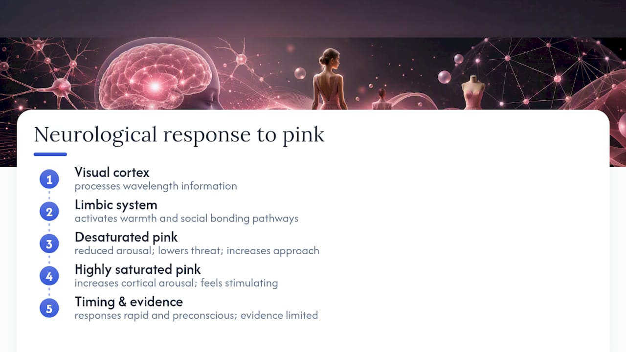
The brain’s response to pink begins in the visual cortex, where wavelength information is processed and passed to the limbic system — the seat of emotional response. Pink’s position on the spectrum, as a desaturated red, means it activates some of the same neural pathways associated with warmth and social bonding that red triggers, but with reduced arousal intensity.
Research into color and affect suggests that warm, low-saturation colors like dusty pink tend to lower perceived threat and increase approach motivation — the neurological state associated with openness and connection. Highly saturated pinks, by contrast, can increase cortical arousal in ways that feel stimulating rather than calming. This is consistent with the Baker-Miller evidence: the specific hue matters, and the brain’s response is not uniform across the pink family.
Neuroimaging studies on color and emotion remain a developing field, and direct causal claims about pink specifically are not yet supported by large-scale neurological data. What the evidence does support is that color-emotion associations are processed rapidly, often before conscious awareness, and that pink’s associations with warmth and nurturance appear early and consistently in Western developmental psychology.
Why humans may be wired to respond to pink
Evolutionary theorists have proposed that human sensitivity to pink-adjacent hues may have adaptive roots. One hypothesis centers on skin tone: across many human populations, a rosy or flushed complexion signals cardiovascular health, arousal, and fertility. The ability to detect and respond positively to these cues would have carried survival and reproductive advantages.
A second hypothesis involves environmental cues: ripe fruits, dawn light, and certain flowers all carry pink and rose tones. Sensitivity to these hues may have been reinforced over millennia as signals of food availability, seasonal change, and safe environmental conditions.
Neither hypothesis is settled science, and both are complicated by the enormous cultural variability in pink’s meanings across human societies. What they offer is a plausible biological substrate for why pink tends to register as warm and approachable rather than threatening — a foundation on which culture then builds its own, far more complex, meanings. The gendering of pink is not part of this biological story; it is a recent cultural overlay, not an evolutionary inheritance.
Pink, femininity, and the luxury wardrobe — a considered perspective

There is a version of the pink conversation that reduces the color to a gender signifier, and it does the color a disservice. Pink’s psychological richness — its capacity for tenderness, defiance, sensuality, and restraint, depending entirely on shade and context — makes it one of the most expressive tools in a luxury wardrobe. The mistake is treating it as a statement about identity rather than as a considered aesthetic choice.
What the Baker-Miller evidence teaches us, beyond its specific claims about aggression, is that color’s effects are contextual and temporary. A pink that soothes in the first moment can irritate with overexposure. This is not a reason to avoid pink; it is a reason to use it with the same precision and intentionality that defines any genuinely luxurious choice. A dusty-rose Italian silk dress, worn with restraint and paired with the right accessories, does not announce femininity — it embodies a particular quality of attention to beauty that transcends any single association.
At Vivien Lauren, the approach to pink in curated collections reflects this understanding. The styling of an elegant pink dress is never about the color alone; it is about the interplay of shade, material, silhouette, and occasion. Pink chosen thoughtfully, in a shade that honors the wearer’s complexity rather than flattening it, is among the most quietly powerful choices in a woman’s wardrobe. That is what unapologetically feminine luxury looks like in practice.

The Vivien Lauren collection and the art of wearing pink well
Pink, understood through the lens of color psychology, rewards precision. Vivien Lauren’s curated selection brings that precision to life in three distinct expressions.

A dusty-rose Italian-crafted dress in fine fabric exemplifies the millennial pink principle: muted enough for sophistication, warm enough for genuine presence. The cut and drape do the emotional work that a louder shade would undermine. A rose-tone handwoven scarf in a tactile natural fiber carries the warmth of coral pink close to the face, where its flattering quality is most felt. A deep-rose leather accessory — a structured bag or a refined belt — anchors any outfit in the sensual, mature end of the pink spectrum, where luxury lives most comfortably.
Each piece reflects the shade guidance in this article: muted where restraint serves elegance, deep where depth signals value. Browse the full women’s collection at Vivien Lauren or shop the dress edit to find the pink that speaks to your wardrobe’s particular language.
Sources
FAQ
What does the color pink mean psychologically?
Pink most consistently signals warmth, nurturance, tenderness, and approachability in Western psychology, though its specific meaning shifts with shade — pastel reads as calm and innocent, while hot pink reads as energetic and defiant.
What emotion is most connected to pink?
Tenderness and warmth are the most reliably documented emotional associations with pink, particularly in lighter shades. Deeper, more saturated pinks tend to evoke excitement or sensuality rather than calm.
Is pink a mental health color?
Pink, particularly the Baker-Miller shade, has been used in institutional settings with the intention of reducing agitation, but controlled studies show the calming effect is short-lived and inconsistently replicated — it is not a reliable therapeutic tool on its own.
What personality type is drawn to pink?
People drawn to pink tend to score higher on warmth, empathy, and openness in personality research, though individual and cultural variation is significant. Pink preference is not a fixed personality marker; it shifts with age, context, and cultural background.
How does pink work in luxury fashion branding?
Muted and dusty pinks signal modern sophistication and emotional accessibility without excessive sweetness, making them the most effective shades for luxury branding. Saturated pinks work best as deliberate seasonal statements rather than foundational palette choices.
Recommended

This fashion piece has been written and brought to you by Sammy Li. On behalf of Vivien Lauren. Vivien Lauren. Luxury. Craftsmanship. That's Proudly Italian. Vivien Lauren. Proud To Style.


