
The Luxe Layer: Mix Textures for an Ultra-Premium Look
- Chloe
- May 31
- 10 min read
The art of Layering for an Elegant Look.
Mastering texture contrast is key to achieving a luxurious, polished outfit without overspending. Using the 60/30/10 rule, layering structured and flowing fabrics creates depth, sophistication, and visual harmony. Recognizing fabric qualities like reflectivity and rigidity empowers you to assemble refined ensembles that exude effortless elegance.
You invested in beautiful pieces, yet your outfits still fall short of that effortlessly polished, high-end feeling you admire. The frustration is real, and the reason is almost never the quality of what you own. The secret to achieving the luxe layer how to mix textures for an ultra-premium look lies not in spending more, but in understanding how different fabric surfaces speak to one another. Texture is the invisible architecture of a sophisticated outfit, and when it is layered with intention, even simple pieces transcend into something genuinely exquisite.
Table of Contents
Key takeaways
Point | Details |
Texture creates perceived luxury | Contrasting fabric surfaces engage the eye and signal refinement far beyond price tags alone. |
Use the 60/30/10 formula | Build outfits with 60% foundational matte, 30% contrasting texture, and 10% shiny accent for balance. |
Precision beats volume | Slim, fine-fabric layers convey more polish than heavy, bulky combinations stacked together. |
Color and scale matter equally | A cohesive color palette lets texture contrast carry the outfit without visual noise or confusion. |
Self-evaluation is a skill | Develop a checklist habit to assess texture balance and catch common layering errors before leaving home. |
Understanding fabric textures in luxury layering
Before you can master mixing textures for luxury, you need to speak the language of fabric with confidence. Every textile carries three distinct qualities that determine how it interacts with other materials in your outfit: light reflectivity, rigidity, and temperature. Understanding these three parameters transforms you from someone who shops by instinct into someone who dresses with genuine authority.
Light reflectivity is perhaps the most powerful of the three. Matte fabrics, like wool crepe or brushed cashmere, absorb light and create a grounded, substantial feeling. Shiny fabrics, like satin or patent leather, bounce light outward and draw the eye immediately. Fleecy or napped surfaces, like velvet or bouclé, diffuse light in a way that reads as richly textured without overt glamour. Textured contrast increases viewer engagement by 40%, which helps explain why a well-layered outfit commands a room in a way that a single-fabric ensemble simply cannot.
Rigidity shapes your silhouette. Structured fabrics like leather, stiff brocade, or tailored tweed hold form and create clean lines. Flowing fabrics like chiffon, silk, or cupro drape and move with your body, adding grace and femininity. When you layer a rigid piece against a fluid one, you create that precise push-and-pull that luxury dressing is built upon.
Here are the key luxury fabric categories and what they bring to a layered look:
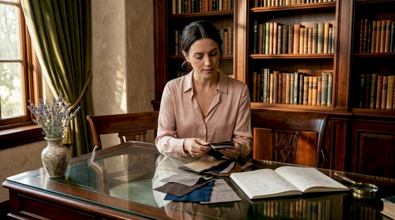
Silk and satin: High reflectivity, fluid drape, and an almost luminous surface that works beautifully as the contrasting 30% layer against matte foundations.
Cashmere and fine knit: Soft, matte, and warmly tactile, making them ideal as foundational base textures with quiet visual authority.
Leather and suede: Structural and boundary-defining, leather provides shape that anchors lighter fabrics and prevents an outfit from reading as shapeless.
Velvet: Opulent, light-diffusing, and deeply sensory. Velvet is best used as a statement piece in the 30% contrasting zone.
Chiffon and organza: Ethereal and light, these work as accent layers that add dimension without weight.
Learning to recognize these qualities in a garment before you buy it is one of the most practical skills you can develop. The craft behind luxury fabrics speaks directly to these properties, and understanding how textiles are constructed helps you predict exactly how they will behave in an outfit.
The 60/30/10 framework for texture layering
The most liberating discovery you can make in dressing is that luxury has a formula. The 60/30/10 proportion split gives you a practical, repeatable structure for assembling texture layers that feel intentional rather than accidental. Think of it as a recipe: not rigid, but structured enough to prevent the most common mistakes.
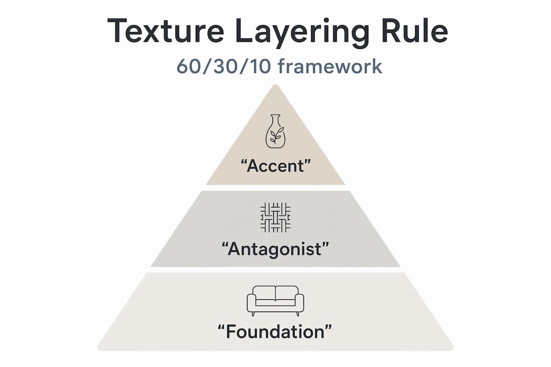
Here is how each role breaks down in practice:
Texture Role | Proportion | Fabric Examples | Purpose |
Foundation texture | 60% | Wool crepe, matte jersey, cashmere, brushed cotton | Creates visual grounding and a calm base for the eye |
Antagonist texture | 30% | Satin blouse, leather trousers, velvet blazer, bouclé coat | Introduces contrast and luxury depth |
Accent texture | 10% | Patent leather belt, metallic clutch, silk scarf, sequin trim | Catches the light and punctuates the overall composition |
In practice, imagine a slate gray wool crepe wide-leg trouser (foundation) paired with a ivory silk blouse (antagonist), finished with a patent leather belt and a woven leather bag (accent). The outfit reads as refined and considered without a single overtly flashy element. That is the quiet sophistication that premium texture combinations produce.
The antagonist texture is where most women underinvest. It is the piece that makes the foundation sing. Satin pairs beautifully with velvet for an opulent evening combination, with linen for casual sophistication, and with chiffon for something ethereal and special-occasion worthy. The key is that each pairing answers a different mood while following the same structural logic.
Pro Tip: If you find yourself reaching for fabrics that match in both color and texture, that is the first sign of mono-texture flatness. Use this formula as a shopping filter: ask yourself which of the three roles a potential purchase fills before you commit to it.
The 10% accent zone is where adding accessories with texture contrast transforms a well-dressed look into a genuinely luxurious one. Patent leather shoes, a metallic clutch, or a silk scarf knotted at the neck, all cover approximately 10% of your visual silhouette while delivering disproportionate impact.
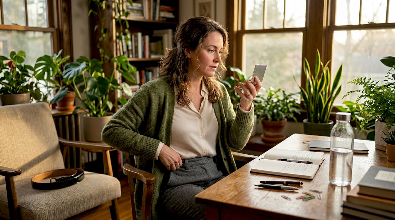
Styling techniques for elegant texture mixing
Understanding the formula intellectually is one thing. Translating it into a real outfit, standing in front of your wardrobe on a Tuesday morning or preparing for a dinner that matters, is another. These steps bring the theory into your hands.
Start with your foundation garment. Choose the largest-surface piece first. Wide-leg trousers, a midi skirt, or a structured sheath dress in a matte, neutral-toned fabric anchors the entire composition.
Introduce your antagonist texture at the upper body. A silk blouse, a leather jacket, or a velvet blazer placed at the top half draws attention upward and creates immediate visual interest.
Position luminous fabrics near your face. Silk near the face brightens your complexion by reflecting soft light upward. This is a quiet trick of the truly sophisticated dresser.
Add your accent at the waist or carried in the hand. A belt in patent leather or a bag with woven texture punctuates the outfit without competing with the larger layers.
Step back and assess proportion. If two of your three textures are shiny, the eye has nowhere to rest. Rebalance by swapping one high-reflectivity piece for something matte.
Common mistakes deserve specific attention here. Layering two bulky fabrics, such as a chunky knit over a thick wool coat, creates visual weight without elegance. Intentional layering in 2026 is less about bulk and more about precision. A slim cashmere turtleneck tucked into wide-leg trousers under a structured leather coat is a masterclass in streamlined luxury. Each layer earns its place.
Pro Tip: When you incorporate a complex texture like sequins or embossed leather, keep every other silhouette element clean and unembellished. Complexity in texture requires simplicity in cut.
The art of enduring winter elegance through thoughtful layering expands on how these same principles apply across seasons, and it is worth studying for the specific challenges that cold-weather dressing presents.
Balancing color, scale, and texture contrast
Once you have your texture framework in place, the next level of refinement involves color harmony and scale. These two elements can either amplify or completely undermine your texture work.
Color first. A cohesive, narrow color palette, think ivory, camel, and cognac or charcoal, midnight, and silver, allows texture contrast to do all the visual heavy lifting. Monochrome outfits rely heavily on texture contrast for depth because without color variation, the eye seeks interest elsewhere. This is precisely why an all-black outfit in matte crepe, patent leather, and chiffon reads as extraordinarily refined rather than flat or simple.
Scale is equally important but less discussed. Mixing a fine-gauge cashmere knit with a chunky boucle coat creates textural dialogue. Wearing two chunky-scale textures simultaneously creates noise. Here is how to think about this practically:
Pair fine with coarse: a smooth silk blouse against a textured tweed skirt.
Pair flat with dimensional: a matte jersey dress with a woven leather bag that has visible surface variation.
Pair sheer with opaque: a chiffon overlay on an otherwise structured, substantial base layer.
Accessories deserve special attention in this context. A patent leather belt worn over a matte wool dress does not merely pull the outfit together visually. It acts as a punctuation mark, a moment of shine that tells the eye where to look. Metallic accents complete a layered outfit by introducing the final texture dimension that a purely matte ensemble lacks.
Pro Tip: When your outfit feels “almost there” but not quite polished, the missing element is almost always the accent texture. Add one metallic, patent, or high-shine piece and reassess.
Troubleshooting your luxe layer results
Even with the best intentions, texture layering can go wrong. Developing the ability to assess and self-correct is what separates a woman who dresses well occasionally from one who dresses beautifully as a matter of habit.
Use this checklist before you leave the house:
Does the outfit have at least two distinct texture categories present?
Is there a clear hierarchy, one dominant texture, one supporting, one accent?
Are both or all three textures competing for attention equally? If yes, remove the least intentional one.
Does the overall silhouette read as clean, or does bulk obscure the shape?
Is there at least one moment of light reflection, however subtle?
If your outfit feels over-busy, the fix is almost always subtraction. Remove the most complex texture and replace it with something matte and understated. If it feels flat and dull, add a single high-reflectivity element, a satin slip skirt instead of matte jersey, or a patent shoe instead of a suede one.
Signs that your outfit has achieved the luxe effect are equally worth recognizing. Your eye moves through the outfit rather than stopping abruptly. The silhouette reads as intentional. There is a sense of depth to the overall look, as though it rewards closer attention. Digital wardrobe apps can help you visualize combinations before committing, which is particularly useful when you are building new outfits from pieces you already own.
“Luxury is achieved through the controlled clash of textures. Matte with shiny, hard with soft. Not through uniform smoothness.”
This principle, once truly absorbed, changes the way you shop, dress, and understand style altogether. A minimalist luxury wardrobe built on intentional texture contrast will always outperform a larger wardrobe assembled without this awareness.
My perspective on mastering the luxe layer
I spent years believing that luxury dressing meant uniformity. Matching fabrics, consistent finishes, and coordinated sets felt like the hallmark of polish. I was wrong, and recognizing that was one of the most freeing moments in my understanding of fashion.
What I have learned, through dressing a range of women across occasions and body types, is that the outfits that genuinely command admiration are always built on tension. Not clash or chaos, but deliberate, thoughtful tension between opposing surfaces. A rigid leather jacket over a fluid silk dress. A matte crepe trouser against a luminous blouse. Softness and structure held in conversation with each other.
I have also found that women who struggle most with texture layering are often the most disciplined shoppers. They buy quality pieces individually but have never been given a framework for assembling them. Once they understand the 60/30/10 logic, their existing wardrobes transform overnight. Nothing new required, just a new way of seeing what they already own.
My honest advice: trust the formula until it becomes instinct. Start with one substitution, swap your matte top for a silk one, or exchange your leather flats for suede. Notice what changes. The education is in the wearing.
— Vivien Lauren
Discover textured luxury pieces at Vivienlauren
At Vivienlauren, every piece is designed with precisely these layering principles in mind. The curated collections offer the matte foundational staples, the fluid silk blouses, and the structured occasion dresses that form the three texture roles explored throughout this article. You will find elegant women’s fashion spanning each texture category, from smooth Italian-crafted fabrics to tactile woven details, all selected to work beautifully in combination rather than isolation. The handmade woven leather bucket bag is a perfect example of the 10% accent texture that transforms a look, offering visible surface variation and genuine craftsmanship. Browse the occasion dress collection for layering-ready silhouettes that become even more exquisite when paired with thoughtfully chosen textures.
FAQ
What textures create a luxury look in fashion?
Luxury reads most powerfully when matte and shiny textures are placed in deliberate contrast. Pairing cashmere or wool crepe with silk, satin, or patent leather creates the visual depth that signals refinement and intentionality.
How does the 60/30/10 rule work for mixing textures?
The 60/30/10 rule divides an outfit into 60% matte foundational texture, 30% contrasting antagonist texture, and 10% shiny or accent texture. This proportion creates balance and prevents any single element from overwhelming the overall composition.
What fabric combinations work best for an ultra-premium look?
Satin pairs well with velvet for opulent dressing, with linen for relaxed sophistication, and with chiffon for ethereal occasion wear. Leather combined with silk or fine knit is consistently one of the most refined premium texture combinations across both casual and formal contexts.
How do I avoid looking bulky when layering textures?
Prioritize slim, fine-fabric layers under structured outerwear rather than stacking heavy textures together. Reserve voluminous or chunky fabrics for one focal piece and balance them with sleek, low-profile layers on either side.
Can texture mixing work in a monochrome outfit?
Absolutely. A monochrome outfit actually depends on texture contrast for its entire sense of depth and sophistication. When color variation is removed, the interplay between matte, shiny, and tactile surfaces carries the full visual interest of the look.
Recommended
The art of Layering fashion guide has been authored and brought to you by Chloe. For Vivien Lauren. Vivien Lauren. Luxury. Craftsmanship. That's Proudly Italian. Vivien Lauren. Proud To Style.
